Allows you to create columns in Obsidian
This plugin also works on mobile with a column wrapping feature (that you can enable in settings)
NEW: Callout syntax use the col and col-md callouts to make your columns
Adds a special list syntax to create columns.
Adds two codeblock languages: col and col-md.
The col-md codeblock is just markdown
The col codeblock renders each markdown element as its own column.
- use the md codeblock to group elements as one column Adds col and col-md callouts to create columns without javascript
The callout syntax uses no javascript at all, which makes it highly compatible with live preview without the use of codeblocks, this also means that the callout syntax cannot limit the height of the columns.
The col callout renders every item in the callout as its own column, but col-md groups them into one column
To use the col callout, create a callout with the col name:
> [!col]
> A col callout
>
> Second column of the callout
To use the col-md callout, create a col-md callout within the col callout
> [!col]
> A col callout
>
>> [!col-md]
>> The second column of the callout
>>
>> More lines on the second column of the callout
The col-md callout's width can be adjusted by adding the width after the col-md name:
> [!col]
> A col callout
>
>> [!col-md-3]
>> The second column of the callout
>>
>> This column is now 3 times the width of the first column
The width attribute of the col-md callout can only be multiples of 0.5 up to 10, like 1, 1.5, 6.5, etc. due to limitations of live preview and CSS attr() function.
More columns can be nested within other columns simply by creating a new column within the callout. More examples can be seen below.
All blocks have a settings header that is defined as everything above a === delimiter
- col
- height: CSS height or
shortest
- height: CSS height or
- col-md
- height: CSS height
- flexGrow: number
For example, to set the flexGrow value in a col-md block:
```col-md
flexGrow=2
===
MD to be rendered
```
All blocks have a height setting which can limit the height of the codeblock to any CSS height value (ex: 100px)
The col codeblock can have a height of shortest, which limits all columns to the shortest height of its children.
For example:
````col
height=shortest
===
```col-md
line 1
line 2
line 3
line 4
```

```col-md
line 1
line 2
```
````The col-md block has an additional flexGrow setting which sets the relative width of the codeblock

Produced by the MD below:
```````col
``````col-md
flexGrow=1
===
> [!info] Callouts
>  Stuff inside the callout
>  More stuff inside.
>> [!ERROR] Error description
>>  Nested callout
>>  `````col-md
>>  - example MD code
>>  - more stuff
>>  `````
``````

``````col-md
flexGrow=2.5
===
# Text annotation example:

`````col
````col-md
flexGrow=1
===
1. Function name **a** should be more descriptive

2. Remove **if/else** by using **||**
````

````col-md
flexGrow=2
===
```js
function a(word) {
	if (word != null) {
		console.log(word);
	} else {
		console.log("a");
	}
}
let msg = "Hello, world!";
console.log(msg)
```
````
`````
``````
```````
!!! Dont forget to use additional backticks when using recursive codeblocks! Ex: col has 4 ticks and col-md has 3
or using callout syntax:
> [!col]
>> [!info] Callouts
>> Stuff inside the callout
>> More stuff inside.
>>> [!ERROR] Error description
>>> Nested callout
>>> - example MD code
>>> - more stuff
>
>> [!col-md-2.5]
>> # Text annotation example:
>>> [!col]
>>>> [!col-md]
>>>> 1. Function name **a** should be more descriptive
>>>> 2. Remove **if/else** by using **||**
>>>
>>>> [!col-md-2]
>>>> ```js
>>>> function a(word) {
>>>> 	if (word != null) {
>>>> 			console.log(word);
>>>> 	} else {
>>>> 		console.log("a");
>>>> 	}
>>>> }
>>>> let msg = "Hello, world!";
>>>> console.log(msg)You can also create columns by creating a list in the structure shown (not supported in live preview):
- !!!col
- (flex-grow)
- (Text in column 1)
- (flex-grow)
- (Text in column 2)
- (flex-grow)
Produced by the MD code below:
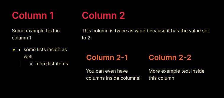
- !!!col
	- 1
		# Column 1
		Some example text in column 1
		- some lists inside as well
			- more list items
	- 2
		# Column 2
		This column is twice as wide because it has the value set to 2
		- !!!col
			- 1
			  ## Column 2-1
			  You can even have columns inside columns!
			- 1
			  ## Column 2-2
More example text inside this columnThis setting ensures that columns are a certain width. If not all the columns satisfy this width, extra columns will wrap to below (as rows). Technically, just sets the flex-basis attribute.
This setting sets the default span value for a column if it is not explicitly specified. For the time being, col codeblocks have each column set to this value and cannot be changed.
- Enable syntax highlighting for editor.
- Have per column group and per column settings (custom settings for each column)

